

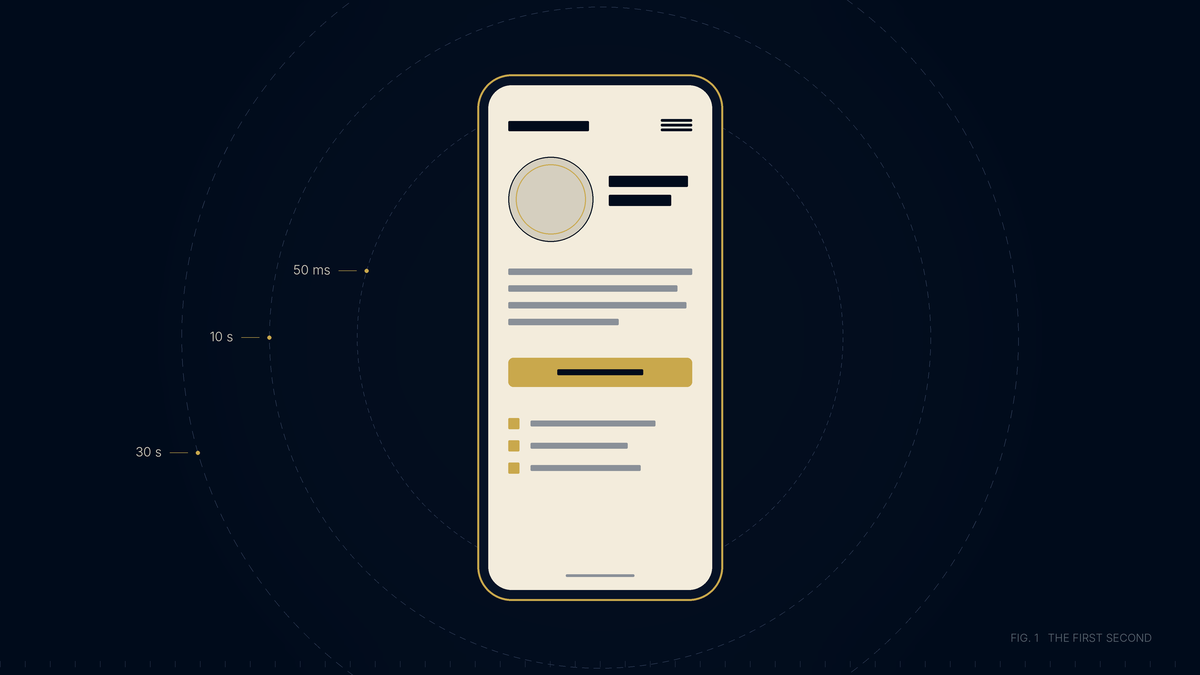
Your website is the first conversation a prospective client has with your firm. It lasts about a minute, they decide how much to trust you inside the first second of it, and the lawyer is not in the room. When Statistics Canada asked Canadians who had faced a serious problem or dispute and had not gone through the courts what they did about it, 51 percent said they searched the internet, and one in three contacted a legal professional. Clio's 2025 consumer survey in the United States found the same direction of travel, with more than half saying they would turn to the internet for a future legal problem and firm websites and online reviews playing strong roles in the search.
That person is on a phone, often late at night. They have been charged, or served, or let go, or hurt, and they are comparing you to the two other firms open in adjacent tabs. The whole visit lasts about a minute, and the lawyer is not in the room for it.
Here is what that person reads, in the order they read it, and what the research says about each step. The last section is a review you can run on your own phone before lunch.
What does a client decide in the first second?
Gitte Lindgaard and her colleagues at Carleton University in Ottawa showed people web pages for 50 milliseconds and asked them to rate visual appeal. The ratings matched the ones given after half a second, and they held steady when the same pages were rated a second time. The study, published in Behaviour and Information Technology in 2006, concluded that designers have about 50 milliseconds to make a first impression, and that the impression carries forward. A visitor who decides a page looks poor reads the content through that judgment.
The Stanford Persuasive Technology Lab asked 2,684 people to evaluate the credibility of live websites and analyzed what they commented on. The look of the site came up in 46.1 percent of comments, ahead of how the information was organized at 28.5 percent and whether it was focused at 25.1 percent. B.J. Fogg, who led the study, summarized it as "looking good is being good", and noted that people apply the same test to television news and politicians.
Jakob Nielsen's reading of a Microsoft Research study of visit lengths across 205,873 web pages adds the clock. The first ten seconds decide most exits. A page that survives ten seconds gets another twenty of scrutiny, and a visitor who stays thirty seconds is likely to stay two minutes. His instruction is that the page has to communicate its value within ten seconds.
For a law firm, the practical reading is that the top of the homepage on a phone screen, before any scrolling, has to say who you act for, in which matters, in which city, and how to reach you. It also has to carry a real photograph of a lawyer, because a visitor reads the face before the text. If that screen shows a stock image of a courthouse column and a line about commitment to excellence, the visitor has already classified the firm as generic and is reading the rest to confirm it.
What does the Law Society read when it reads your website?
Rule 4.2-0 of the Law Society of Ontario's Rules of Professional Conduct defines marketing to include advertisements and other similar communications in various media, along with firm names, letterhead, business cards and logos. A website is marketing. Three rules then apply to every page of it.
Rule 4.2-1 permits a lawyer to market legal services only if the marketing is demonstrably true, accurate and verifiable; is neither misleading, confusing or deceptive, nor likely to mislead, confuse or deceive; and is in the best interests of the public and consistent with a high standard of professionalism. Rule 4.2-1.1 requires a lawyer marketing legal services to specifically identify in all marketing materials that they are licensed as a lawyer. Rule 4.3-1 bars a lawyer from advertising as a specialist in a field unless the Law Society has certified them in it.
Fees have their own rule. Under Rule 4.2-2, a lawyer may advertise fees if the advertising is reasonably precise about the services covered by each fee, states whether disbursements, third party charges and taxes are extra, and the lawyer strictly adheres to the advertised fee in every applicable case. That matters on a website because the easiest thing to publish, a free consultation or a flat fee from a round number, is also the easiest thing to publish carelessly.
Other provinces work from the same language. The Federation of Law Societies' Model Code carries the true, accurate and verifiable standard. The Law Society of Alberta does not certify specialists and prohibits claims to be a specialist in Alberta. Lawyers certified in another jurisdiction may identify that certification where the applicable advertising rules permit.
A client will never cite Rule 4.2-1 to you. They feel the thing it protects. A page that says best, most experienced or aggressive reads like an advertisement, and the research above says advertisements get discounted on sight. A page that says year of call, the courts the lawyer appears in, and links to the Law Society directory reads like a lawyer. Verifiability is a design brief as much as a compliance one. Every claim on the site should sit next to the thing that proves it.
Where does the website hand off to a person?
Clio hired a research firm to contact 500 law firms in the United States by email and phone, posing as prospective clients with ordinary questions about fees, process and booking a consultation. Thirty three percent of firms replied to the email, down from 40 percent when Clio ran the same exercise in 2019. Forty percent answered the phone, down from 56 percent. Counting the firms that called back later, 48 percent could not be reached by phone at all. Twelve percent of the shoppers said they would recommend the firm they contacted, and the ones who reached a person by phone were more than three times as likely to say so as the average.
The same report found that prospective clients go to law firm websites looking for fee and process information and often leave without it, that 7 percent of firms run a chatbot, and that three in five people would only use one if they could switch to a human when they wanted to.
That is American data.
The contact page is where the site makes a promise that a person then has to keep. The page should carry a phone number that dials when tapped and is answered by a named person during stated hours. The form should say what happens after the visitor presses send, and when, and a human should do exactly that. If the firm offers a consultation, the page should say whether it costs anything, and if a fee is stated it has to meet Rule 4.2-2. If the page promises a reply within one business day, Rule 4.2-1 makes that a verifiable claim, so promise it only if the front desk keeps it on a Friday afternoon in August.
What does a client feel but never see?
Speed
Google measures real visitor experience against three thresholds it calls Core Web Vitals. The largest element on the page should load within 2.5 seconds, the page should respond to a tap within 200 milliseconds, and the layout should not shift by more than a score of 0.1 while it loads. Google judges a page on the 75th percentile of real visits, so the slow phones on bad connections count. PageSpeed Insights reports all three for any URL.
Accessibility
Since January 1, 2021, Ontario Regulation 191/11 under the Accessibility for Ontarians with Disabilities Act has required businesses with 50 or more employees to make their public websites conform to WCAG 2.0 Level AA. Most law firms are below that threshold, so the website requirement does not bind them. The client with low vision reading a divorce lawyer's site on a phone at midnight is still there. Contrast, text size, tap target size and alt text on images are the four things that fail most often and cost the least to fix.
Consistency
The firm's name, address and phone number on the site should match the Google Business Profile and the Law Society directory character for character, and the structured data in the page code should carry the same identity. Search engines and the AI answer engines that increasingly sit above them reconcile those records to decide whether the firm is who it says it is.
How do you review your own site in fifteen minutes?
Do this on mobile data, away from the office network, and write the answers down.
- Open the homepage and count how many seconds pass before you can read it.
- Without scrolling, say out loud what the firm does, for whom, in which city, and how to call. If you cannot, the visitor cannot.
- Find a real photograph of a lawyer in the first screen or the first scroll.
- Open your own bio. Check that it states your year of call and that a reader could confirm your licence with the Law Society directory from the page.
- Search the site for best, top, leading, aggressive, specialist and guarantee. Each one is a Rule 4.2 question.
- Check that every award or ranking names the body that gave it and the year.
- Tap the phone number. Confirm it dials. Call it at 7 pm and see who answers.
- Submit the contact form with a plausible question. Read the confirmation and note when a person replies.
- If the site mentions a consultation or a fee, call the front desk and confirm the words match.
- Run the homepage and one practice page through PageSpeed Insights on mobile and record the three Core Web Vitals.
None of those ten items requires a redesign. Half are copy and process, and a firm can fix them this month. The other half are the reason a directed brand shoot and a rebuilt site exist, and they are the work Veritas describes on the Services page under brand experience. This review is also the first thing we run inside the free assessment, alongside the search and map audits.
The Law Society rules described here are general information for lawyers and firms, not legal advice. Check the current rule with your own regulator before you rely on it.